BP
Design for Print
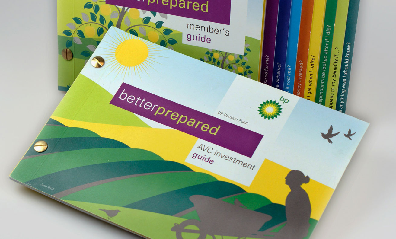
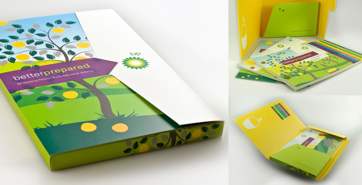
When BP needed a new identity for its in-house pensions offering we won the pitch with a proposal that gave them a organic look fitting with the bio-fuel styling. It started with an idea – to illustrate and associate the pension investment in a way that aligned itself with the bio fuel life cycle. Buy seeds, plant them and watch them grow. We showed illustrations in the BP colour palette of planting seeds, choosing your crops (investments) seeing the risks (crows), protecting your investment (fences and scarecrows) and then right through to reaping the rewards (harvesting the crops).
- BP
- Petroleum
- May, 2017
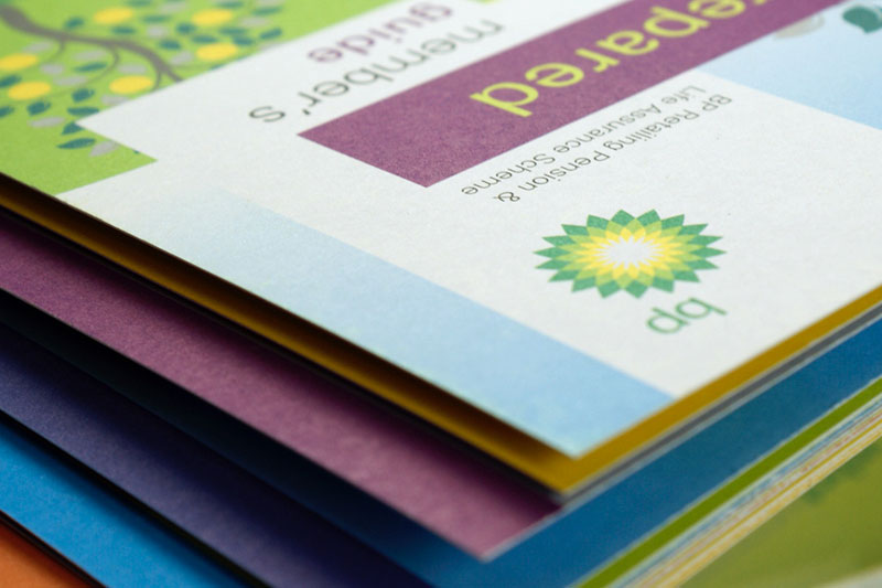
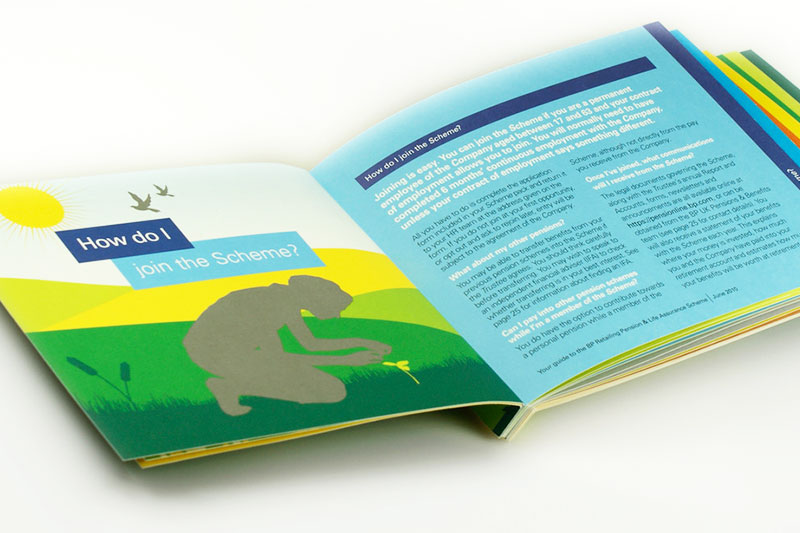
The design we specified fit beautifully with the green look and credentials that BP have been striving towards achieving.
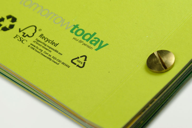
In line with BP’s green aspirations, we specified FSC recycled uncoated papers, no glues or laminates were used. We bound the brochures with recyclable brass binding screws to further reinforce the natural look. The results were stunning, not only aesthetically but in pension take up and understanding of risk.
The final crowning glory for this project was the introduction of a new logo exclusively for the pension scheme. To say we have designed a new logo for BP is a big thumbs up in our book!
