First established in 1855 in the UK, Savills has grown into a firm with a strong foothold in the global property market. Savills employs more than 30,000 people across a network of 600 offices and associates worldwide. They are the number four global agent by world turnover and are ranked the property industry’s number one employer. That’s an impressive introduction by anyone’s standards.
Savills has operated six offices on the Côte d’Azur since 2012 and further strengthened its position by launching Savills Monaco in 2014. We were approached by Savills to design their new promotional brochure for real estate in Monaco and a new set of business cards. There was an emphasis that these two designs had to make Savills stand out. The Monaco property market, like many other top destinations for the world’s elite, is fiercely competitive and for good reason, property prices average at €40,000 per square metre… With the penthouse on top of the Odeon Tower listed on the market for $400,000,000. That would be some commission!
The promotional brochure had to be persuasive and needed to make people want to give up the country they are currently calling home and emigrate. If only it was as easy as plugging them into FaceTime and showing them the crystal blue waters of the Mediterranean or the pastel blue backdrop of the sky.
 Monaco is seen as a stable, tax-friendly jurisdiction and an attractive lifestyle choice in terms of accessibility, culture, education and health. But then so are a lot of places, what makes Monaco unique? Introducing brand 98000, which is also the postcode for the Monaco area. We used this number because we felt it was powerful, it’s also possibly the future postcode of the client and we wanted them to know that. We wanted them to know that everything from the front page on is what you could expect from residing in the 98000 area.
Design details:
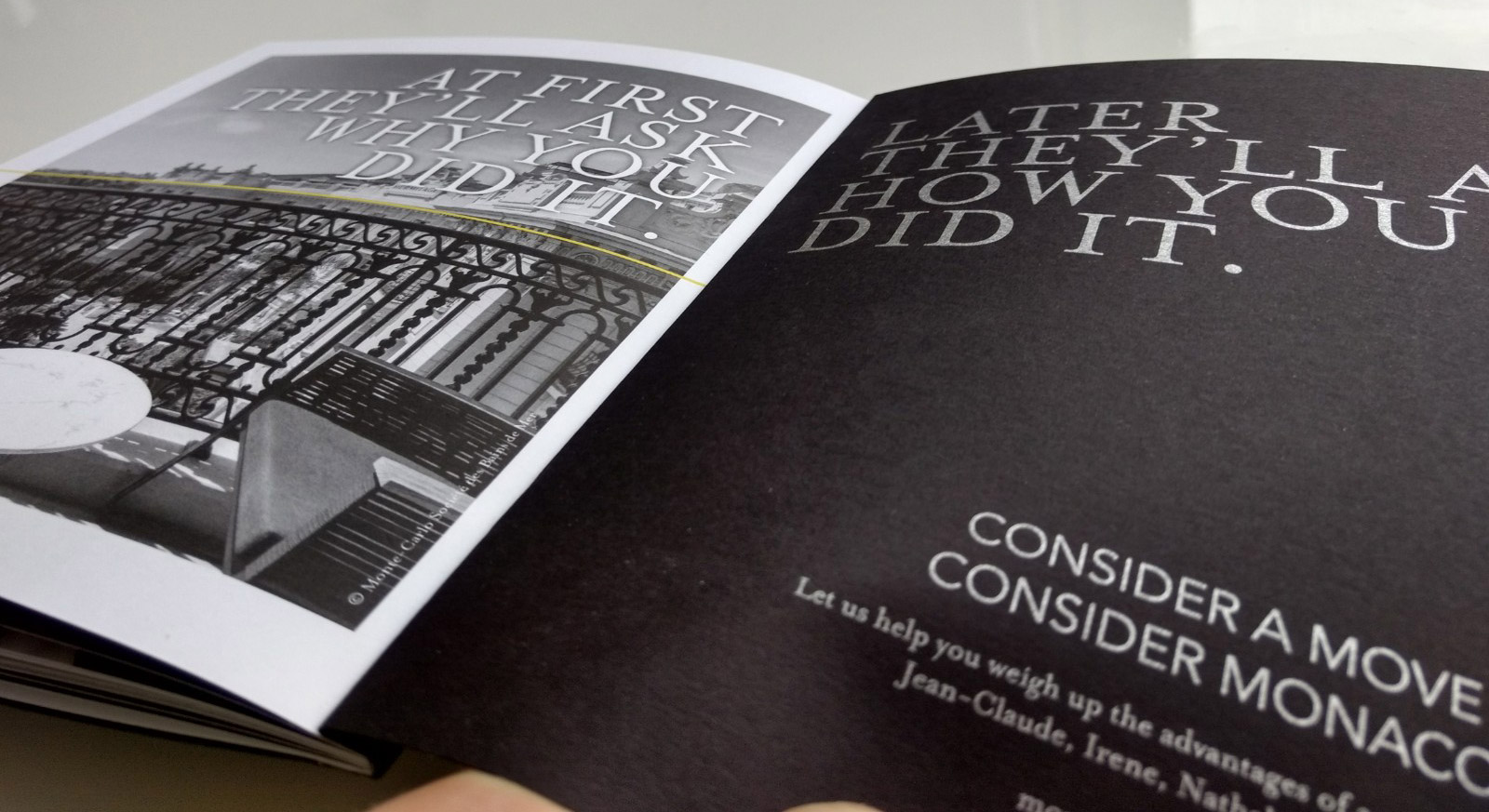
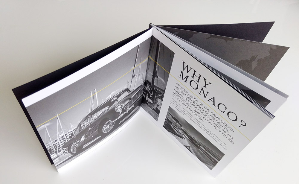
We collaborated as a team which included a rising star in graphics design, Lydia Easun to formulate a design. The brochure has a subtle monochrome metallic effect throughout which reflects the timelessness of the Côte d’Azur, steeped in a history of film stars, billionaires and playboy racing drivers we felt each page of the brochure had to
reflect an air of exclusivity. To get this effect we used a black card as the base colour and shade, then converted the cover image for the lighter part of the photo to be printed in Pantone metallic silver. We added just a touch of the signature Savills yellow to align an association between Savills and the image of Monaco we were portraying, without having to stamp their logo all over the place.
We used a technique called PUR perfect binding that creates a modern square spine using an adhesive that suits the thickness of the paper. For the finish, we chose to use uncoated papers for a more classic matte look.
The brochure used various visuals such as data charts/ graphs, we created these in-house. We also sourced all of the photographs, the typesets and layouts for the project and created the overall design.

